
" PANTONE 35 Inspirational color palettes "
나는 팬톤을 좋아한다. 왜 아니겠어.
이런 책을 발견. 좋은 기사와 함께.
나는 어떤 색일까? 자문하곤 한다. 자문으로 모잘라 막 사람들한테 물어본다. 이전에 한 번 이벤트도 거하게 했던 적도 있다.
색을 다루는 일을 하다보니, 더 집요하게 생각한다. '내가 원하는 컬러', '나를 나타내는 컬러', '나의 트레이드마크가 될 수 있는...'
컬러팔레트를 보는 일은 언제나 재미나다. 이 카드는 팬톤의 35가지 영감을 주는 컬러 팔레트이다.
허핑턴포스트에서는 '저자들과 어울리는 팬톤의 컬러 팔레트' 를 제시했다.
꼭 그렇지 않을때도 있고, 올커니 싶을때도 있는데, 재미지다.
기사는 http://www.huffingtonpost.com/2012/08/24/pantone-color-palettes-_n_1827603.html?ncid=edlinkusaolp00000003#slide=1424546
몇가지만 추려보면,
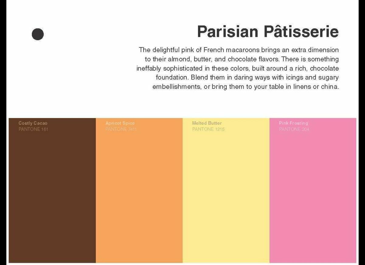
빠리지안 빠티시에
- 마르셸 프루스트
"Pink frosting surrounding rich chocolate and almond tones--French pastries are as complex in hue as they are in flavor. Of course, no writer is more closely associated with French pastry than Marcel Proust and his famous madeleine. With its hues of Costly Cacao, Apricot Spice, Melted Butter, and Pink Frosting, we think he'd find this palette particularly inspiring. "
난 프루스트를 읽다 말아서 모르겠지만, 이건 혹시 '마들렌' 에서 단순연상된것 뿐인거 아닐까?

프렌치 컨트리
- 플로베르
"Remaining in France for a bit, the colors of Pantone's French Country palette brought to mind Gustave Flaubert. Would Madame Bovary's life have been easier if her home had been decorated in Cendre Blue, Super Lemon, Antique White, and Dress Blues? Probably not, but we still wish she'd had the chance to find out."
마담 보바리가 이런 삶을 살았었다면. 이라고 말하면서, 왜 산뜻한 프렌치 컨트리와 보바리의 플로베르를 엮어놓은 것일까?

주얼리 체스트
- 이디트 와튼 ( Edith Wharton 우리말로 어떻게 쓰는지 모르겠다)
"The opulence of these colors, their richness, depth, and complexity reminds us of Edith Wharton. Born into privilege, Wharton's observations of the peculiar tragedies of her social class are as powerful now as when she wrote them a century ago. She deserves to be surrounded in jewels as complex as she was. Mrs. Wharton would have loved this palette of African Sapphire. Serpentine, Apple Jade, and Black Onyx."

사일런트 스크린
- 레이몬드 챈들러
이건 공감
"The master of American hardboiled detective fiction, Raymond Chandler would have felt right at home surrounded by the colors of the Silent Screen palette. His compromised heroes, sharp dialogue and lyrical descriptions fit perfectly in this noir-inflected, grey-to-silver-to-charcoal palette of Star White, Bone White, Gray Violet, and Moonless Night."

메트로폴리탄의 오후
- 헨리 제임스
이 팔레트 맘에 든다. 헨리 제임스와도 어울려.
"The richness of old master paintings emanates from these deep, luxurious colors, which feels right for Henry James, who migrated from America to Europe and back again throughout his life. The New World-meets-Old World colors of this palette -- Antique Citron, Ancient Sun, Green Nymph, and Old Chestnut--could easily be the backdrop for his novels about collisions of Americans with Europe and Europeans. "

얼리 메도우
- E.M. 포스터
이건 꽤 닮아있다. 포스터의 어떤 책을 떠올려봐도 공감


" We think the great 20th century English novelist of class and the search for connection would enjoy these colors meant to evoke the fresh, misty air of a spring morning. For the author of "Howards End" and "A Room with a View," we offer First Lilac, Meadow Breeze, Open Sky, and Early Sunshine. "

코티지 가든
- 제인 오스틴
이것도 매우 적절. 제인 오스틴이랑 이거랑 엮으려고 이 기사를 쓴게 아닌가 싶을 정도로.
"Cottage Garden's grassy green and lush florals evoke the fashions and décor of Austen's "three or four families in a country village." The relaxed beauty of these colors would provide a deceptively sweet backdrop for Austen's irony and sharp social commentary. We imagine her delighting in this palette of Young Wheat, Garden Green, Nimbus Cloud, and Skyway."
책, 아니 카드는 9월 1일 도착한다.
내가 원하는 영감도 얻을 수 있으려나?